OCEAN PLASTIC MINI PROJECT - VEGA 2019
This is a mini project I did for my specialization at Vega. It was to do about ocean pollution such as nurdles and micro-plastic. The brief was to research more into micro-plastic, it's effects and impacts it has on the environments and life. With this, we must create a new type using the found waste lying on the beaches and create a call to action. I chose to base my type on single use plastics has it does not decompose or isn't biodegradable to the environment.
From our research, we had to present 5 concepts with a call to action and then pick the best one. The five of my concepts were about how micro-plastic is damaging animals (sea and land) and the effects it will have on our future. My 5 concepts were:
I started to play around with a cursive, flowing type which is to mimic the sea and create a less harsh impact on the viewer. I tried to lay it out in different ways so it flows together and it is comfortable to read and understand. In the, the final type flowed well together and the use of space was neat.
For the call to action, I wanted to make a statement, not too long but not too short, enough that will engage with the viewer and let them understand that plastic is becoming more of a problem now. In the end a chose 'single use plastics have an effect on the ocean. REDUCE this risk by RECYCLING and SAVE THE PLANET'. It is short and too the point.
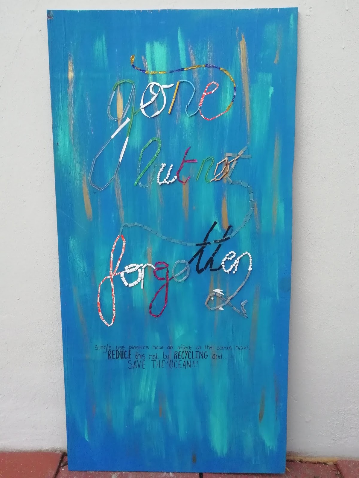
The background colour, I wanted to have a less sinister look, more of a calm look and feel to it. I chose to use a dark shade of blue with a lighter green-blue colour. This created the effect of the ocean and had an aesthetic look to it. I chose to add gold touches to bring the blues out and represent the sand. In the background is an idea of what the ocean could look like if we start reducing our waste. In the end, I proportioned the type and sub-heading in the middle of the area and used space well. It makes the eye flow with the words and creates a soft call to action them.
A problem I face was that I did not proportioned my actual type onto the board like I did in my final scamp. I had to repaint the other side of the board and trace the lettering from a piece of paper onto the board. In the end, it was a challenge to see the lettering onto the board but it came out almost has exactly the final reference. I used washed up plastics found on the beach for my type. I had to individually cut up each item and glue it so it is readable. I create a mosaic type in the lettering with the pieces so it would be able to still show the curves of the lettering. To finish off, I wrote the call to action under the type as indicated in the final drawing.
Process:


From our research, we had to present 5 concepts with a call to action and then pick the best one. The five of my concepts were about how micro-plastic is damaging animals (sea and land) and the effects it will have on our future. My 5 concepts were:
- I am drowning
- DURTBIN
- You KILLED Us
- Hell On Earth
- Gone but not forgotten
I started to play around with a cursive, flowing type which is to mimic the sea and create a less harsh impact on the viewer. I tried to lay it out in different ways so it flows together and it is comfortable to read and understand. In the, the final type flowed well together and the use of space was neat.
For the call to action, I wanted to make a statement, not too long but not too short, enough that will engage with the viewer and let them understand that plastic is becoming more of a problem now. In the end a chose 'single use plastics have an effect on the ocean. REDUCE this risk by RECYCLING and SAVE THE PLANET'. It is short and too the point.
The background colour, I wanted to have a less sinister look, more of a calm look and feel to it. I chose to use a dark shade of blue with a lighter green-blue colour. This created the effect of the ocean and had an aesthetic look to it. I chose to add gold touches to bring the blues out and represent the sand. In the background is an idea of what the ocean could look like if we start reducing our waste. In the end, I proportioned the type and sub-heading in the middle of the area and used space well. It makes the eye flow with the words and creates a soft call to action them.
A problem I face was that I did not proportioned my actual type onto the board like I did in my final scamp. I had to repaint the other side of the board and trace the lettering from a piece of paper onto the board. In the end, it was a challenge to see the lettering onto the board but it came out almost has exactly the final reference. I used washed up plastics found on the beach for my type. I had to individually cut up each item and glue it so it is readable. I create a mosaic type in the lettering with the pieces so it would be able to still show the curves of the lettering. To finish off, I wrote the call to action under the type as indicated in the final drawing.
Process:


 |
| FINAL |


Comments
Post a Comment